- DATE:
- AUTHOR:
- Nicole Shelby

New: Guided group connections for Send carriers
As the Noyo Network of carriers continues to expand, we're simplifying group connections so it's easy to get started with any carrier. Today's note explores this new experience, plus recent releases for speed, accessibility, and easier plan mapping. Let's dive in!
Simple step-by-step
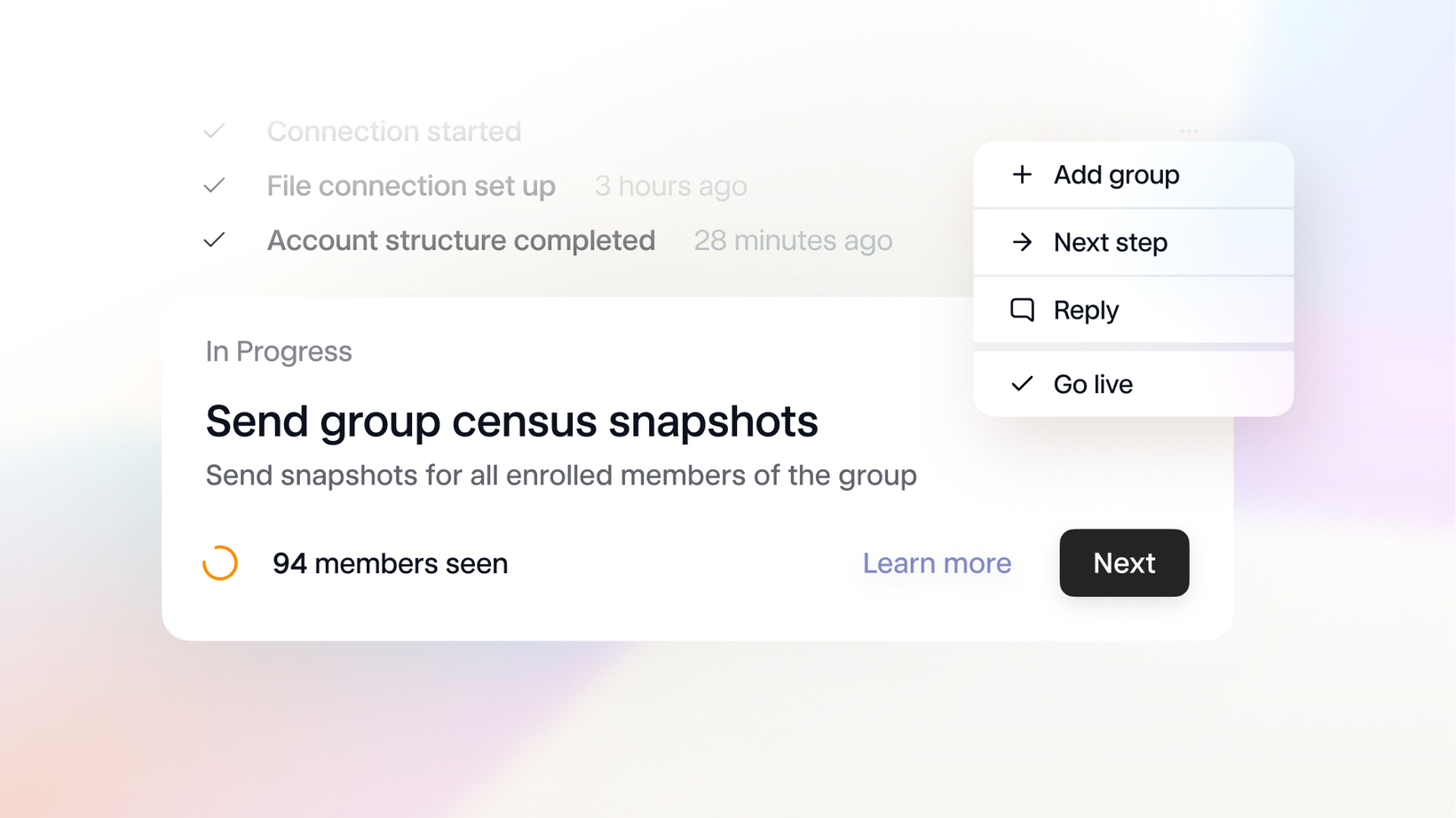
While groups with Sync carrier plans generally only require one API call to get onto the Noyo platform, Send groups have a few extra steps. To help you navigate them, we're introducing a guided workflow in the Command Center that will be triggered whenever you create a new group connection request for a Send group (either in the Command Center or over API). Use this flow to track and complete important tasks, see who's accountable for actions between your team and ours, and ensure your Send groups get connected on time.

Each step has an associated status, which can be fetched via API. For a breakdown of the entire group connection process and associated tasks, check out our Guide.
A shortcut for plan mapping
Most groups managed on the Noyo platform will need to have their plans mapped when they're first connected (more on that here). To make this easier, we're introducing a new "Plan Table" tray on each Connection view. The table lists the plans with key associated info–like Noyo Plan ID, benefit classes, codes, and more–to help you identify each plan in your system. The second section on the page also shows the full plan details we retrieved from the carrier, in case there are additional attributes that may be helpful but aren't displayed in the table.

Speed and accessibility improvements
We've boosted the speed of our Member Snapshots and Transactions pages, and you can even start filtering before the first results are loaded.
We've also made a few improvements with accessibility in mind: you can manually switch the Command Center's theme by pressing c then t and selecting light or dark mode. We've also embedded better support for accessibility modes like high contrast.
For easier reading on smaller screens, you can now collapse the navigation sidebar with the square icon on the top left.
If you've got any suggestions for ways we can make the Command Center easier to use, submit them at any time by pressing f!